How to Create Engaging Infographics for Medical Marketing

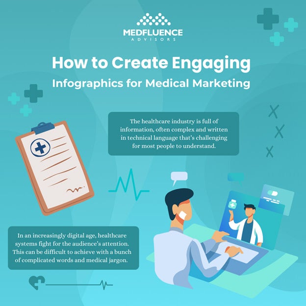
The healthcare industry carries a lot of information. Most often, healthcare information is complex and complicated and is written in a language that’s hard to understand for most.
In an increasingly digital age, healthcare systems fight for the audience’s attention amidst all the noise. This can be difficult to achieve with a bunch of complicated words and medical jargon. When the audience doesn’t understand, they tend to ignore the message and look elsewhere.
We, humans, are visual creatures by nature. Visuals typically have a far greater impact on us than words we say, read, or hear. According to a study from MIT, the human brain is capable of processing entire images the eyes see for as little as 13 milliseconds.
People tend to remember more of what the brain sees as images instead of what it reads as plain text. If healthcare professionals want to widen their reach and convey their brand message to a wider range of audiences, infographics can play a pivotal role in turning things around.
What Are Infographics?
Infographics are a type of graphics that represent data and information in an easily understood way. It is a compilation of information and data in a visual format, helping the audience easily digest often complex and complicated topics.
Infographics use images, colors, and minimal text to explain a topic visually. This helps the reader process the information as a huge chunk of audiences tend to look at graphics instead of reading longer plain texts.
In the healthcare setting, infographics help healthcare professionals deliver health and medical-related information in a way that catches the eyes and attention of the audience. Through infographics, often complex and complicated topics are easily digestible by anyone even without any medical background.
Instead of forcing the audiences to digest text-heavy content, infographics take complicated healthcare topics and transform them into simple, accessible, and eye-catching graphics that don’t sacrifice the quality of information in any way.
Why Use Infographics in Medical Marketing?
The use of infographics in the healthcare industry yields a lot of benefits for the public and healthcare professionals and businesses alike:
-
Patient education and healthcare literacy
Infographics are an effective way to educate patients and increase the public’s healthcare literacy.
When complicated medical information is simplified in visual formats, healthcare systems can attract their audiences and better retain their attention. This helps spread important information regarding public health, current issues, and diseases that might be spreading around.
Additionally, infographics are an effective way to disseminate information regarding certain illnesses, conditions, medication, and treatment options. They help patients understand their condition and options, allowing them to make more informed decisions regarding their healthcare.
-
Healthcare communication in the digital age
Healthcare professionals can leverage infographics to communicate with their patients in an increasingly digital age. Instead of bombarding patients with buzzwords and medical jargon, care providers can use infographics instead to explain symptoms, conditions, and possible treatment plans and procedures.
Infographics can be useful in enhancing the patient’s understanding of complex medical information and letting them fully understand what’s happening to their health.
-
Improve brand awareness
Along with useful and important health information, healthcare infographics will also typically include the name and logo of the medical practice that created and published it. This puts your practice in front of your target audience, improving brand awareness.
Publishing content that educates patients on complicated health topics will also build your authority and credibility in the healthcare industry, increasing patient trust in your practice.
-
Attract and visually appeal to your audience
Visuals are more likely to attract audiences. Using infographics and not only text-heavy content has a better chance of catching the eyes and attention of your audience. When plain text fails to appeal to your target audience, allow visual elements to appease your audience. This helps healthcare systems get their messages across and into their audience’s brains.
-
Boost SEO efforts
When done correctly, healthcare infographics can offer a multitude of benefits to your practice’s marketing and SEO efforts.
Infographics can appeal better to the audience’s attention and combine that with valuable information, other brands and businesses can take notice. They can link to your content if they find it informative. This will help strengthen your SEO rankings, bringing you in front of the right audiences and widening your reach.
-
Increase content shareability
Infographics are easily sharable across different platforms. Increased content sharability will help your practice widen its reach and engage with a multitude of audiences. When done right, your audience can take the initiative of sharing valuable infographic content across communities and platforms. This makes infographics a smart choice to include in your practice’s medical marketing efforts.
How to Create Engaging Infographics for Medical Marketing
Infographics have evolved to become an unstoppable force in medical marketing. Here’s how you can start creating engaging healthcare infographics for your medical practice:
-
Define your goals and objectives and know your audience
The first step to creating an engaging healthcare infographic is to define your goals and objectives. Ask yourself what you want your infographics to achieve. Do you want to spread awareness about certain medical issues? Or do you want to market your practice’s services and bring your brand to the right audience?
Additionally, set a clear definition of your audience. What will your readers and audience be interested in reading about? What kind of content and information will they be interested enough to digest and share on their socials?
-
Choose your topic and stick to it
Effective infographics tackle one key topic and stick to it. Your audience will quickly lose interest if you throw multiple topics at them with only one piece of infographic.
Address one key issue and do so thoroughly yet concisely. This gets your message across quickly and keeps your audience interested.
-
Research the topic and ensure accuracy and regulatory compliance
After choosing your topic, do your research. Collect data and information on the topic. Remember, as a healthcare professional, you have to ensure accuracy. Ensure that all data used in your graphics are backed by science and facts. Stick to reliable sources when presenting data as facts. This will show your audience that your practice is a credible source of healthcare information.
Additionally, don’t neglect regulatory compliance. Healthcare compliance is often a slippery slope. You don’t want to taint your practice’s reputation by violating laws and regulations.
-
Identify a central theme
Help your audience understand your infographics and the data they present by sticking to one central theme. The theme should tell your audience what the infographics are about even at first glance. Use design elements and visuals that are consistent with the topic to achieve a centralized theme.
-
Draft the infographic
Now that you have everything you need from themes to information, start drafting the infographic. Group the information and determine what needs to be included in the infographic. Arrange the information in order of importance.
Use design elements and visuals that go with your theme. Add charts or graphs if necessary. You should also include your practice’s name or logo in the infographics. Remember though that your brand should not be at the front and center of the infographic. Include it in a subtle way that still makes sure your audience knows the infographic was made by your organization.
-
Gather feedback from your team
After designing and creating the infographics, show it to colleagues and other medical professionals within your staff. Ask them what they think of the design, the information presented, and the order in how they’re presented.
You can also ask for feedback from those who are not medical professionals to gauge if those without medical backgrounds can clearly understand the information you are trying to convey.
-
Revise the infographic and work out the details and data
Lastly, revise and make any necessary changes after getting feedback. Remember, do not be stubborn with your design, and be open to making necessary changes.
You can rearrange the visuals, rewrite the words, and tweak the colors if that will add even more quality to your infographic.
The Dos and Don’ts of Medical Marketing Infographics

Now that we’ve gone over the basic steps of creating your own healthcare and medical marketing infographics, here are some more tips for successfully creating effective healthcare infographics for your practice:
-
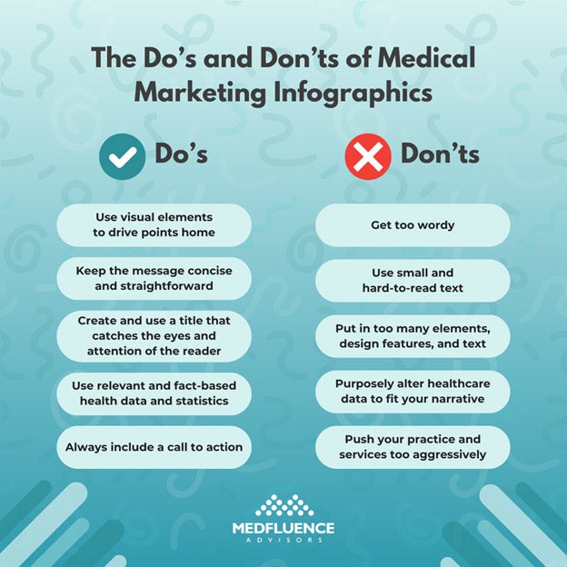
Do: Use visual elements to drive points home
If you want to make focal points in your infographics, use visual designs and elements. This will help the important information stand out and will drive readers to pay more attention. Use a variety of shapes and colors, contrasts, and other visual cues to draw the readers’ eyes where you want them to. This is more effective than conveying messages through plain black-and-white text.
-
Don’t: Get too wordy
Infographics help the audience digest information quickly and easily. Don’t get too wordy and avoid long paragraphs of text. This only makes it harder to maintain the reader’s attention.
Instead, use bite-sized chunks of words where necessary. If you can’t cut down on the words but still relay the message easily, reconsider if an infographic is the best way to go. There might be other content formats that may be better for the message you want to relay.
-
Do: Keep the message concise and straightforward
Even if you have tons of information to support your content, you don’t need to include them all, especially if they’re not necessary to make your main point.
Remember to keep the message concise and always straightforward. Only include data that supports your main topic. If the information isn’t necessary to make your audience understand, then your infographic doesn’t need it.
-
Don’t: Use small and hard-to-read text
If you’re going to include text in your healthcare infographic, don’t use small and hard-to-read text. Instead, use large and bold fonts. Stick to simple fonts too to make information easier to read. Avoid fancy fonts with too much style as this can be hard to read, preventing the infographic from doing its job of delivering messages and informing your audience.
-
Do: Create and use a title that catches the eyes and attention of the reader
Give your infographic a title that will catch the reader’s eyes and retain their attention. The title should make it clear what the rest of the infographic is about but don’t give away everything. Catch their attention just enough that they will look at the rest of the infographic because of a thought-provoking title.
-
Don’t: Put in too many elements, design features, and text
In infographics, less is better. Avoid putting too many design elements and text in the infographics. Simple is better.
Infographics that look chaotic and cluttered with visuals, elements, and text will likely turn away readers. Remember to display only necessary information in a clean and simple way that encourages the audience to keep reading.
-
Do: Use relevant and fact-based health data and statistics
In healthcare, credibility is everything. Use relevant data and statistics backed by facts and science. Never use false information and pass it off as facts.
Additionally, be transparent about your sources and include them in the infographic when necessary.
-
Don’t: Purposely alter healthcare data to fit your narrative
Never purposely alter, edit, tweak, or delete healthcare data and information just so it can fit the narrative you’re trying to sell. Your audience trust healthcare professionals to be truthful and transparent. Never betray that trust. Always show credibility and only present truthful information. You don’t want to tarnish your practice’s reputation by distorting healthcare data.
-
Do: Always include a call to action
Infographics are a great marketing tool. Even though your infographic’s purpose is to educate the public on certain healthcare topics, you will want to leverage that to drive more patients into choosing your practice over your competitors.
Always include a call to action, telling your readers the next step they can take to make informed healthcare decisions.
-
Don’t: Push your practice and services too aggressively
As an effective marketing tool, infographics can include your practice’s name and logo. Still, avoid pushing your practice and services you offer too aggressively in your audience’s faces. This can be off-putting if it appears like you’re too self-serving and only there to sell your practice.
Find a good balance between educating the public on healthcare concerns and marketing your practice. Don’t be too ‘in the face’ about selling your brand. Do so with subtlety and grace.
Conclusion: Create Effective Infographics for Healthcare
Infographics are a powerful tool for businesses and organizations across all industries. The same goes for those in the healthcare sector.
In the healthcare setting, infographics are an effective way to relay often complex and complicated healthcare information into bite-sized, easy-to-understand, and easily digestible content.
People are more likely to easily understand appealing images and visual elements than plain black-and-white text. Healthcare can efficiently leverage this and start incorporating infographics into their marketing and content strategies.
Follow these steps and best practices to start creating engaging infographics that interest and educate your audience.
In today’s digital-first world, building a strong and credible online presence is essential for business success—whether you’re running a…
Accessibility in Healthcare Digital Marketing: Why It Matters and How to Get It Right
Today’s healthcare industry continues to undergo…