Contact Us Pages: The Best Practices, Tips, and Examples
For many businesses, no matter how big or small, their websites play a huge role in directing traffic and converting visitors into actual customers. When designing a business’s site, the Contact Us page is usually just an afterthought for many. Other pages like the Homepage, About Us, and Products and Services often end up higher on the priority list.
While this isn’t inherently negative, it’s worth investing more thought and effort into designing and crafting your website’s Contact Us page. This page holds significance as one of the most frequently visited pages on any site, thus proving its value on your website.
What Is a Contact Us Page?
While a Contact Us page is only one of the many pages on your website, it’s one of the most beneficial pages. Your Contact Us page serves as the beginning of a relationship with new and potential customers.
An effective Contact Us page offers visitors a way to get in touch with your business directly. It offers existing and potential customers a personalized form of communication and eventually builds trust. Through a Contact Us page, existing and potential customers can reach you directly with queries, support, or feedback. A Contact Us page should be easy to navigate and straightforward in hopes of converting visitors instead of driving them away.
What Should Be Included in a Contact Us Page?
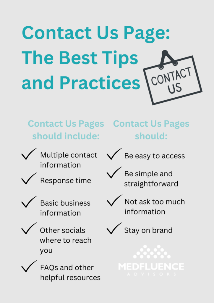
A typical and effective Contact Us page should include the following components:
Multiple channel contact information
A Contact Us page is named as such for a reason – existing customers and potential leads are looking for a way to communicate and reach your business directly. For easier and more direct communication, your page should include your contact information through multiple channels.
The basic contact information should include your business’s email address, phone number, a lead capture form, and contact forms. Some businesses take it further by also including 24/7 automated chatbot support for anticipated frequently asked questions. This gives leads instant answers to their queries, eliminating the waiting time.
Response time
In line with potential leads seeking a means to contact you and receiving a response, your Contact Us page should incorporate a specified response time. This offers them an approximate timeframe for when they can anticipate hearing back from you.
The shorter the response time, the better. Though the typical response time is 24 to 48 hours.
Basic business information
Your Contact Us page is the perfect page to include basic details about your business and its operation. Information like your business location and address, business hours, and ways to contact you (usually phone number and email address) are typically found here.
A pin location on a map is also a smart choice to help people from your community find you faster and easier.
Other socials in which to reach you
Contact forms, emails, and phone calls shouldn’t be the only ways a lead could reach you. Include any social media platforms your business is registered on within your Contact Us page. As a business, it’s basic to be on major social media networks like Facebook, X (formerly Twitter), and Instagram.
Potential customers may prefer to reach out to you through these platforms and you don’t want to turn them away by not providing links to your accounts. Additionally, it makes your business more reachable if you’re registered on any or all of these social media platforms.
FAQs and other helpful sources
Customers and leads seek a means to contact you because they have inquiries that may not be covered on any of your pages. In your Contact Us page, you can also incorporate FAQs and other useful resources to assist them in obtaining a prompt answer without delay.
Chatbots, links to customer service pages, and FAQs are essential components your Contact Us page may need.
Contact Us Pages: The Best Practices and Tips
When you’re creating and designing your website’s Contact Us page, keep these tips in mind:
- Easy to access
Customers and leads come looking for your business’s Contact Us page because they have a question or are confused about something and would like some clarification. Don’t make it any harder for them to get an answer as this can only drive them away.
Instead, make sure your Contact Us page is prominently displayed and easy to access on your website. Some popular spots for the Contact Us page link include the top menu, the sidebar, the footer, or the About page of the website. It would be a wise decision to include a link in each of these spots for much easier access. - Simple and straightforward
While Contact Us pages should reflect your brand, it’s best to keep it simple, clear, and visually appealing. This makes the page more inviting to visitors and easily converts them to actual customers. Stay away from too fancy graphics, designs, and fonts as these may be a major turn-off. Contact Us pages should also be straightforward. Don’t put too many obstacles between your visitors and the information they seek. - Don’t ask for too much information
If your Contact Us page includes forms for visitors to submit queries, it’s crucial not to request excessive or unnecessary information. Asking for too much may appear intrusive and could deter visitors. Usually, a form should only ask for the visitor’s name, email address, and their query. Additionally, providing an option to opt out of promotional emails can be beneficial. - Stay on brand
Your Contact Us page should reflect your brand’s personality and messaging and should be consistent with the rest of your website. This might be a lead’s first encounter with your business so make that first impression worth it. Keeping that in mind, stick to simple designs, as we’ve mentioned above. Your page should be pleasing to the eyes and make it easy for visitors to find the information they came for – which is a way to contact you directly.
10 Best Contact Us Page Examples to Inspire You
Now that we’ve covered the fundamentals of what a Contact Us page entails, including the necessary information and best practices to implement, let’s examine some of the best examples of Contact Us pages that could serve as inspiration for your own:
1. Stanley
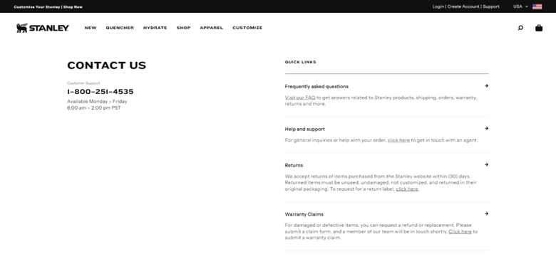
Stanley’s Contact Us page is easily accessible and very easy to find, being located right at the bottom and top of any page on the website. A phone number for customer support is also on the page in a bold and huge font so it’s easily seen by the visitors.
The brand also included information on the days and time customer support is available to assist customers who choose to call.
On the Contact Us page itself, there is an FAQ link for quick questions and answers, split into categories for easy access. It also leads to a link where you can submit a ticket for direct customer support.
2. Scribd
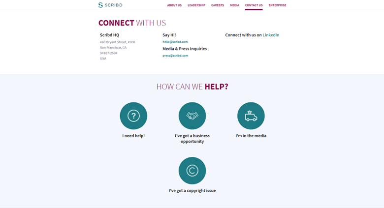
Scribd has a simple Contact Us page.
It has the business HQ address on the page and offers various ways to connect through email or LinkedIn.
There are separate page links for business opportunities and the press and media.
It has a link to an FAQ page that could instantly give visitors an answer to their question without making them wait. The copyright issues button links to an FAQ page on the topic but also offers chatbot access.
The page is easily accessible and located at the bottom of the website.
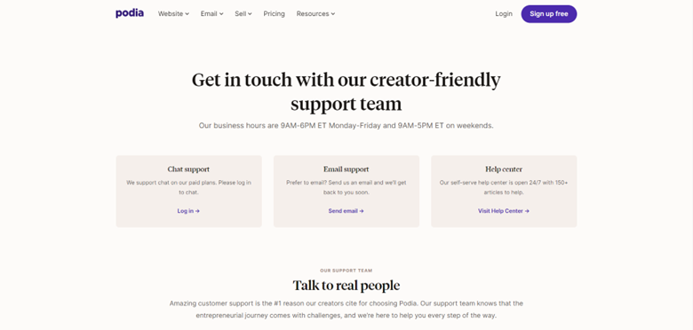
3. Podia
Podia’s Contact Us page is located on the top dropdown menu and the footer on the website, making it accessible to all the website’s visitors.
It offers two ways to get visitors in touch with their team: chat support or email support. The chat support, however, is only available for customers with paid plans. The email support option, on the other hand, is available for all customers whether they’re paying or not.
The page also has a link to their 24/7 help center, which is essentially an FAQ page with 150 articles to help visitors with common queries. This removes the usual waiting time that comes with the email support option.
4. Lush
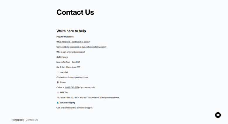
Lush’s Contact Us page is linked at the bottom of their website for easy access.
Within the page, there is an FAQ page mostly addressing online order concerns. There is also an option for live chat support, and text and call support options. It also lets the visitor know the brand’s regular business hours and when they can expect to hear back from the brand’s customer support team.
5. Six Flags
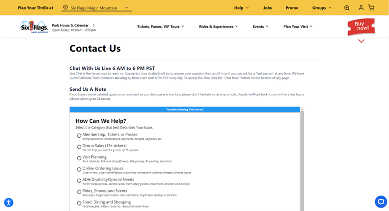
Six Flags has a link to their Contact Us page at the top dropdown menu and at the footer of their website.
On the Contact Us page, they offer both chatbot support and live chat support. Their chatbot support can quickly answer frequently asked questions for those who don’t like to wait.
And if the chatbot software can’t answer specific questions, visitors can request a “real person” to talk to. They also let visitors know when customer support representatives are able to accommodate them by including their business hours on the page.
Visitors can also send detailed notes. Here, visitors will choose categories to make it easier for the right team to get to their queries.
A phone number and mailing address are also provided for more options for getting in touch.
6. Shake Shack
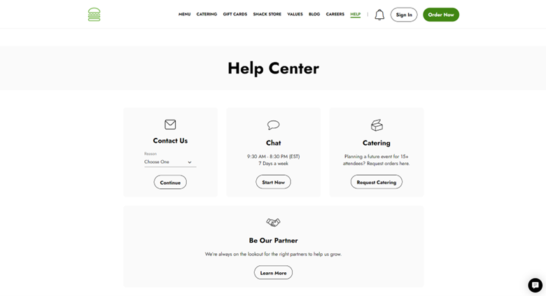
Shake Shack has a direct link to their Contact Us page right at the top and bottom of their website.
On the Contact Us page, visitors can send a ticket detailing their query. The site will ask them to specify a reason for their query in order to forward their ticket to the appropriate department. There is also an available chat support. Shake Shack lets visitors know the days and times customers can expect to hear back from their customer support team.
Catering and business partnership queries have separate links as well for businesses and organizations hoping to start a partnership with the brand.
At the bottom is an FAQ page with several articles answering commonly asked questions.
7. Duolingo
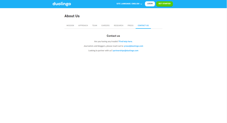
Duolingo has a very simple and straightforward Contact Us page.
There are three categories on the page: general help, press and media, and partnership. This makes it easier for their system to forward queries to the right teams.
The link to the page is easily accessible at the bottom of the website, as well as links to the brand’s various socials where visitors can reach them, if they prefer to.
8. Grammarly
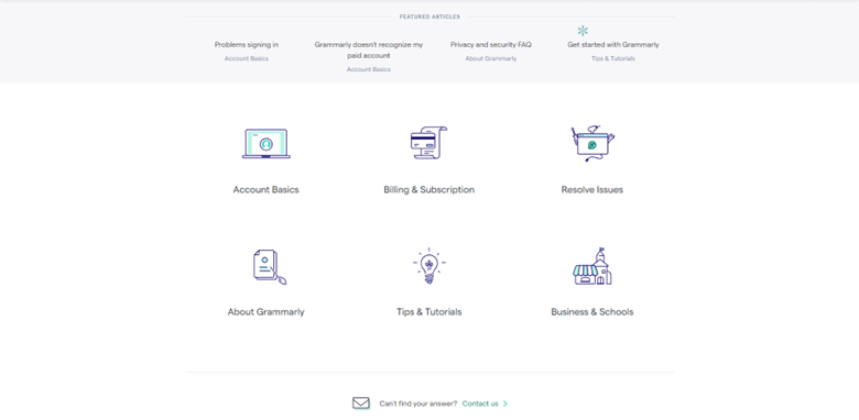
Grammarly has a straight-to-the-point Contact Us page that’s also visually appealing.
At the top of the page are FAQ links divided into different categories that can help visitors with common questions and issues. Visitors can also type and search keywords of their queries into a search bar just about the FAQs. This lets them easily locate the right articles to answer their questions, instead of scouring over several unrelated articles.
The page also gives the option of submitting a contact form for detailed and personalized queries. Here, the site will prompt you to categorize your query so its system will be able to forward your ticket to the right department. This will make it easier to get the correct answer to your concern.
9. Vita Coco
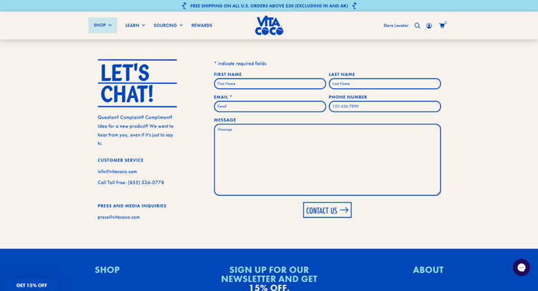
Vita Coco has a very clear and direct Contact Us page that stays on brand with the rest of the website.
From the get-go, it invites you to submit a personalized ticket by simply filling in the required fields. Here, visitors will be able to directly get in touch with their customer support team with any concerns.
On the left part of the screen, Vita Coco enthusiastically invites visitors to submit a form if they have questions, complaints, compliments, ideas, and more. This definitely gives the brand a friendlier tone.
It also gives visitors the option of connecting via email or phone call, whichever is preferred. Press and media queries have a separate email as well, as can be seen above.
10. Dollar Shave Club
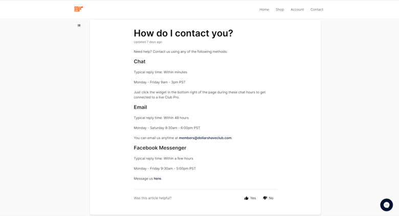
Immediately after clicking on the Contact Us page of Dollar Shave Club, it offers visitors three options to reach out: chat, email, and Facebook messenger.
The chatbot acts as an FAQ chat where visitors can select commonly asked questions. The chatbot then immediately sends relevant articles as a reply. One can also type and send messages to which the chatbot will also reply with FAQ articles it deems relevant. The process is easy and visitors will immediately get the information they came looking for.
To get in touch with the company’s customer support team, the page offers both email and Facebook messenger support options. The page also lets them know when to expect replies from the team.
The Best Contact Us Page Summary
Your website’s Contact Us page is often one of the most frequented links, as visitors come seeking answers to their questions. It serves as a vital bridge that can convert visitors into actual customers, making its creation a priority for businesses. Unfortunately, many treat this page as an afterthought, when it should be given careful consideration.
Keep in mind these best practices tips when you’re designing your website’s Contact Us page:
- Easy to access
- Simple and straightforward
- Don’t ask for too much information
- Stay on brand
These no-brainer tips, plus a few examples of the best Contact Us pages, should give you enough inspiration to make one that works for your business’s goals.
